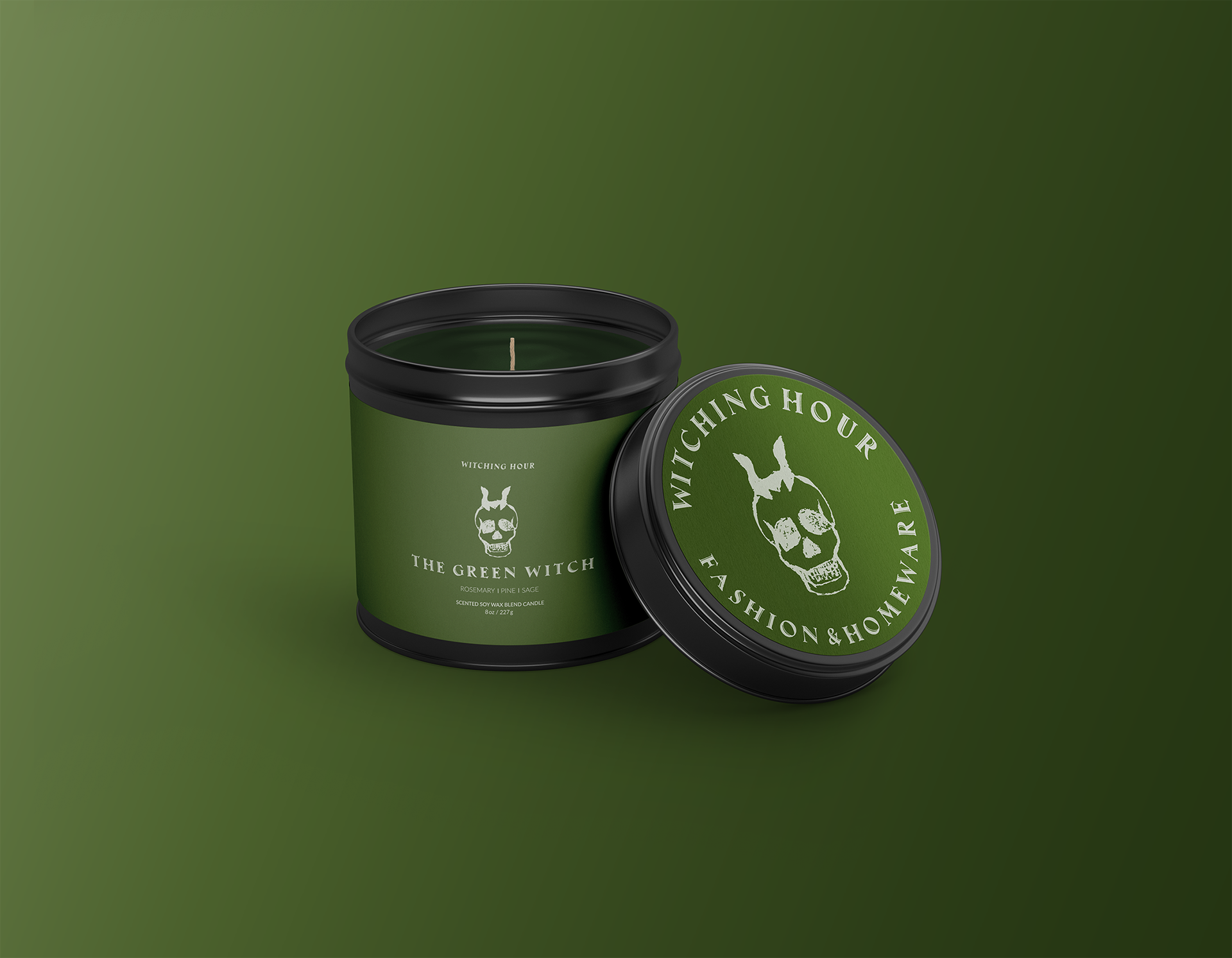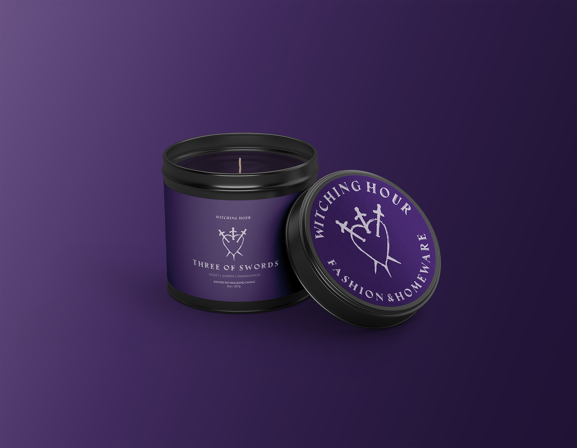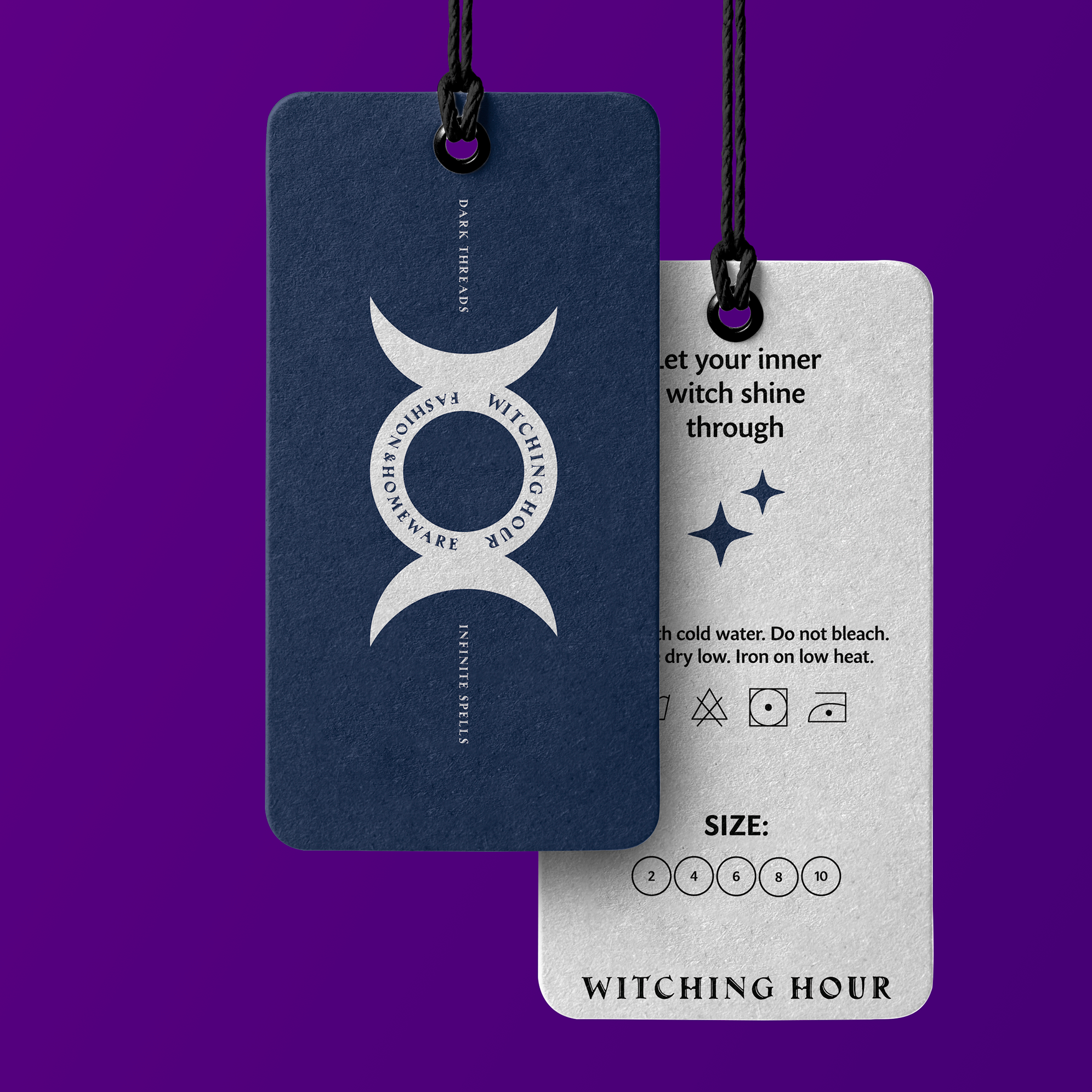
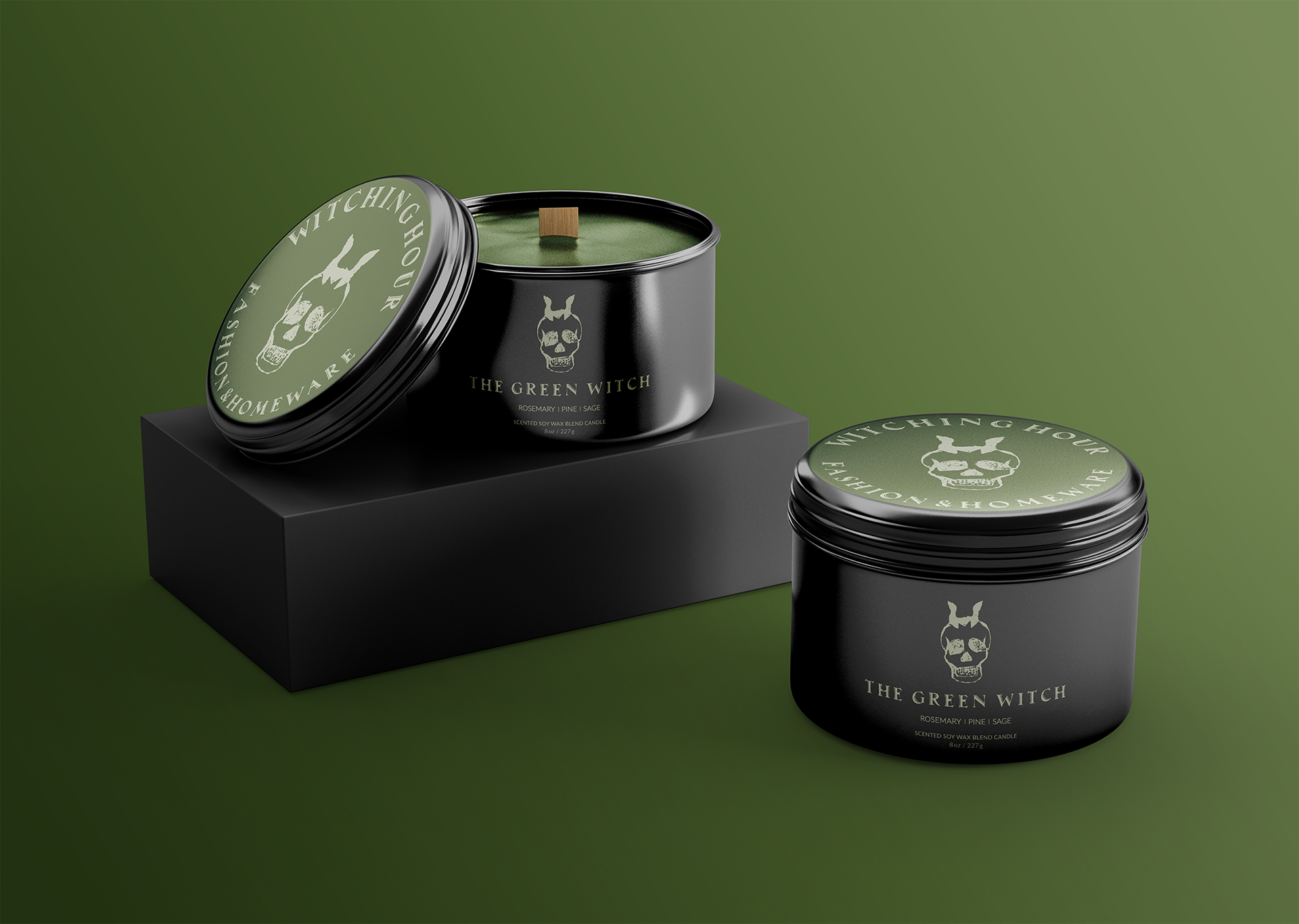
This personal packaging exploration extends the Witching Hour branding into a small candle line, focusing on a simple label system and scent hierarchy that keeps the brand’s dark, witchy mood clear and readable.
All visuals were designed in Adobe Illustrator and presented using Photoshop mockups.
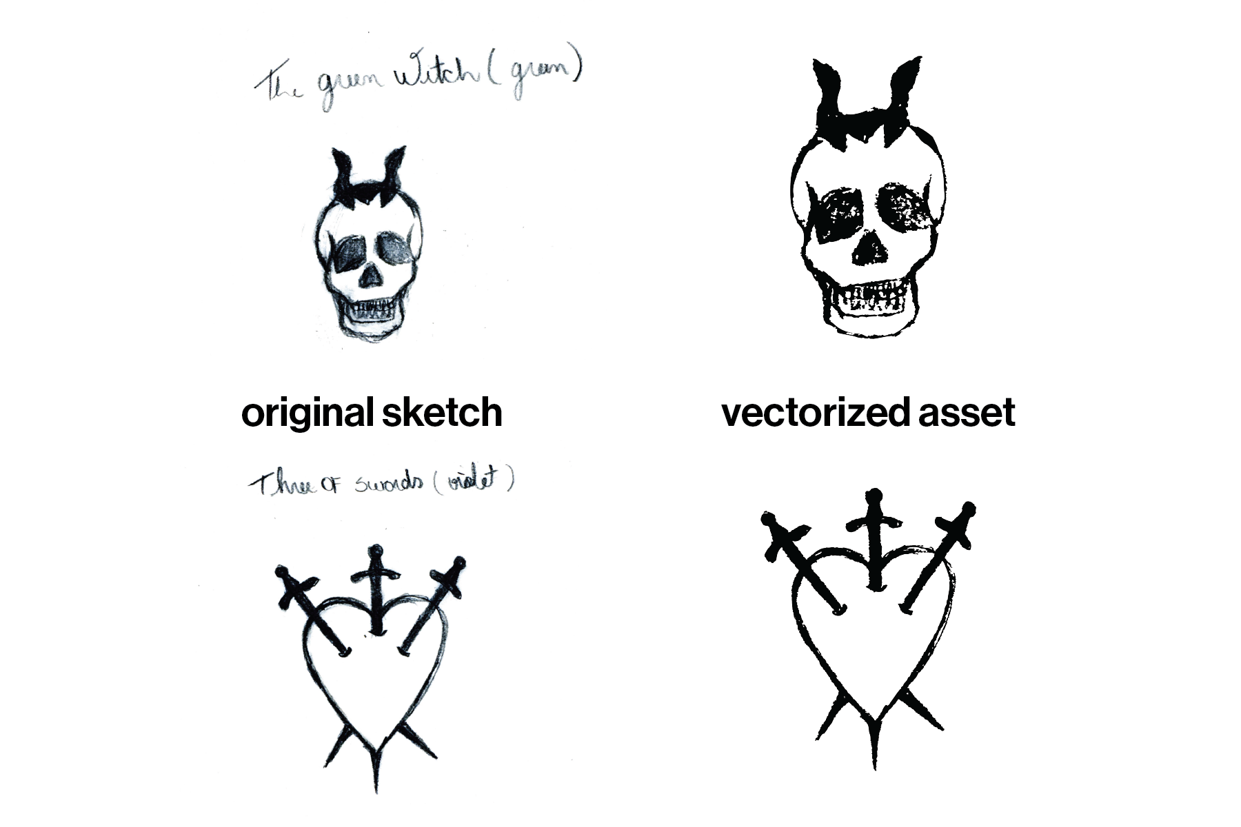
I started by drawing tarot symbols and simplifying them into small witchy icons. The Green Witch is a skull with a tall, crown-like headpiece, loosely based on the Death card and the idea of someone moving between life and death. Three of Swords uses the classic heart pierced by three blades to hint at heartbreak and emotional tension. Both drawings began as loose pencil sketches and were then turned into vectors, keeping a rough, hand-drawn feel so they read more like little sigils than polished logos.
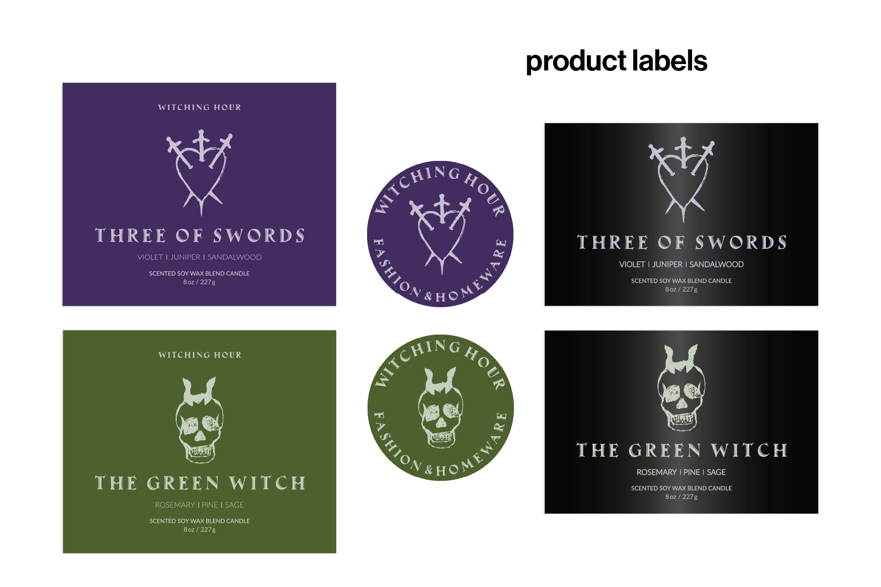
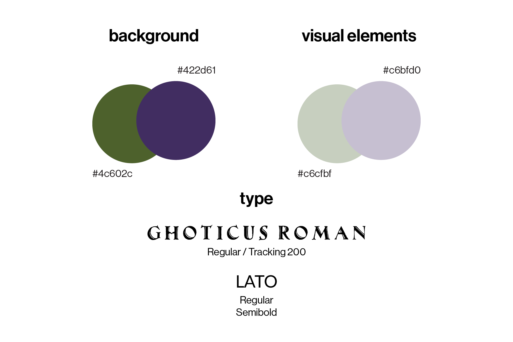
For the labels, I used deep olive green and dark violet as the main backgrounds, with pale sage and soft lavender in the illustrations and small details. Gothicus Roman is used for the candle names, and Lato for the scent notes and product copy, so everything stays readable. Together the colors and type keep the line moody and a bit occult, but still clean enough to feel like a finished product.
In Illustrator, I worked on several label variations in the same file, first in black to check composition and legibility, then in the final purple and green versions. Seeing them side by side made it easier to tweak spacing and choose what worked best for the line.
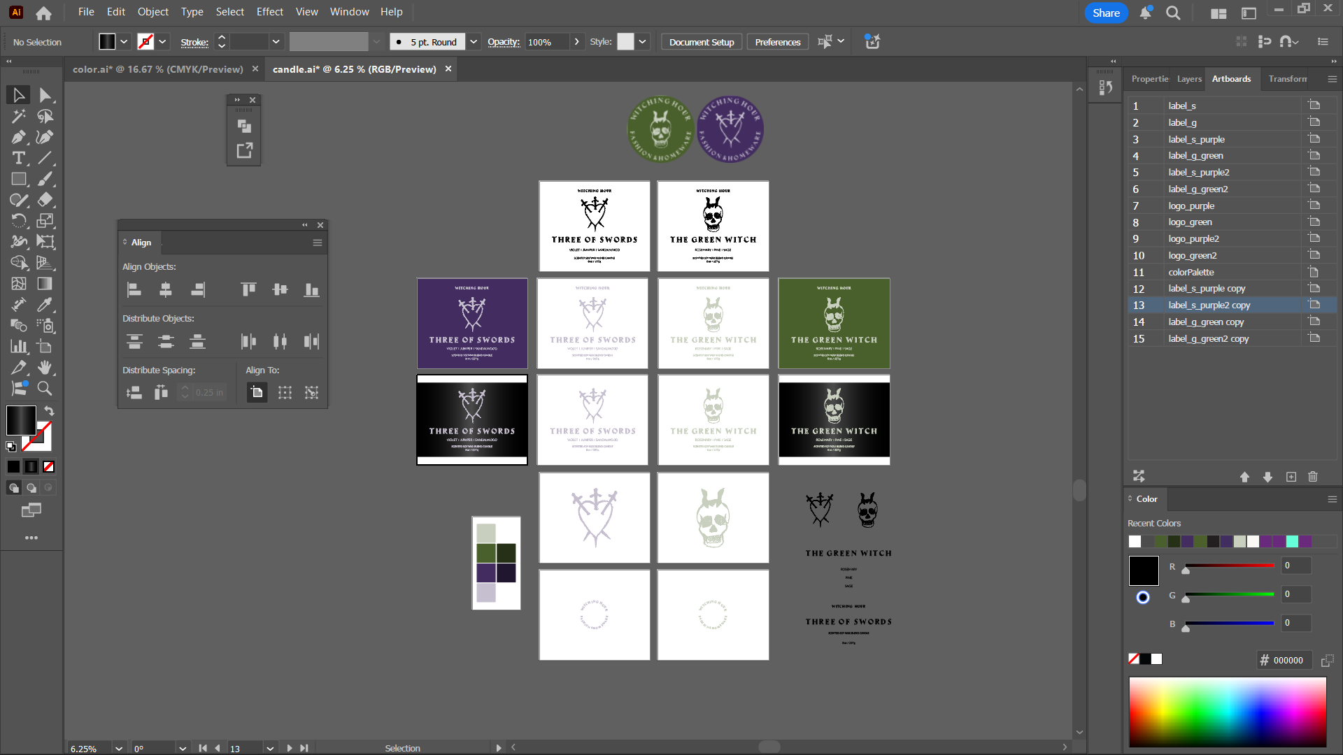
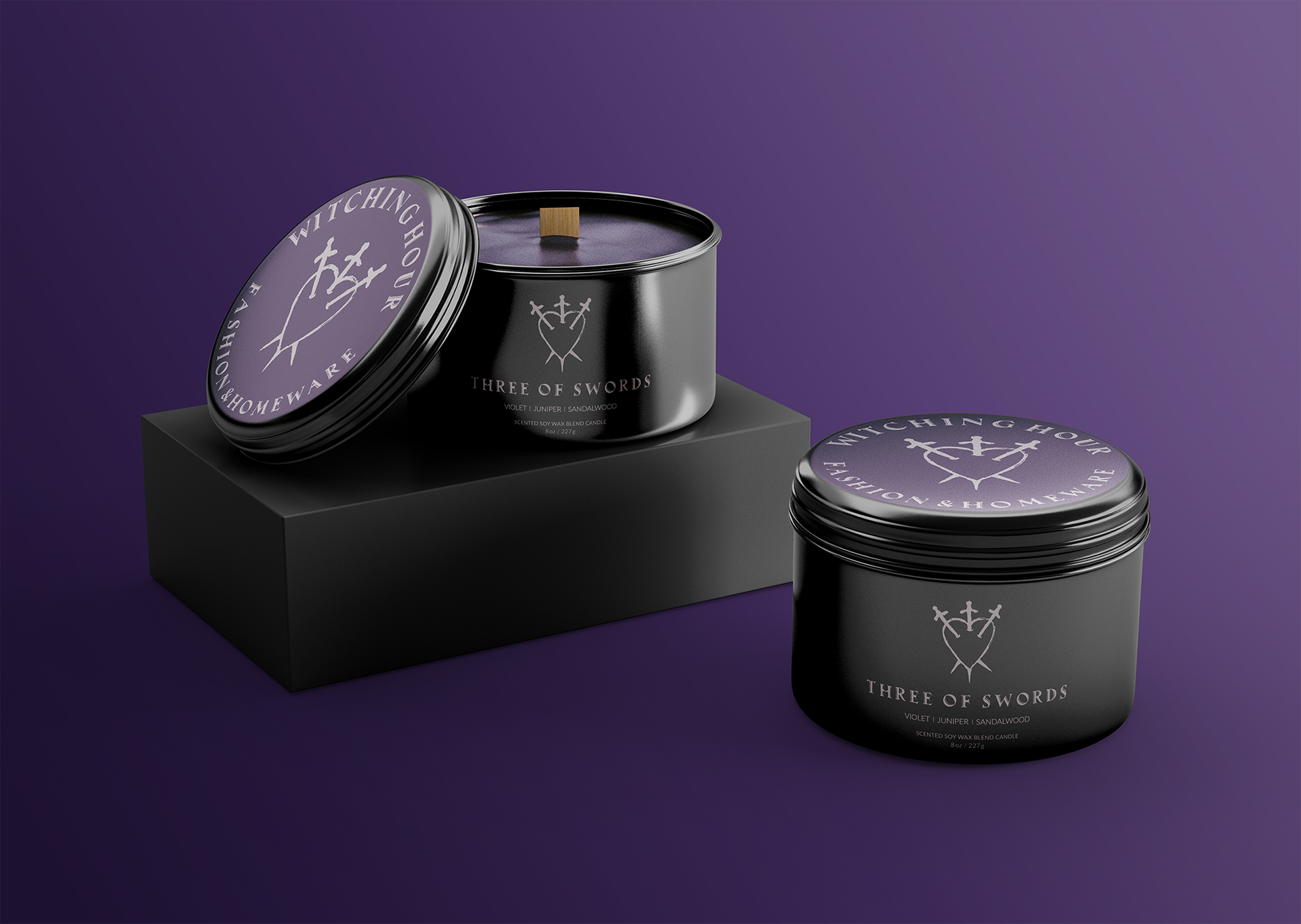
For the label set, the purple and green versions are the main labels with solid color backgrounds, used on stickers and other flat applications. The black versions remove the background color and keep only the light type and illustration, designed to work as direct printing on a black metal tin.