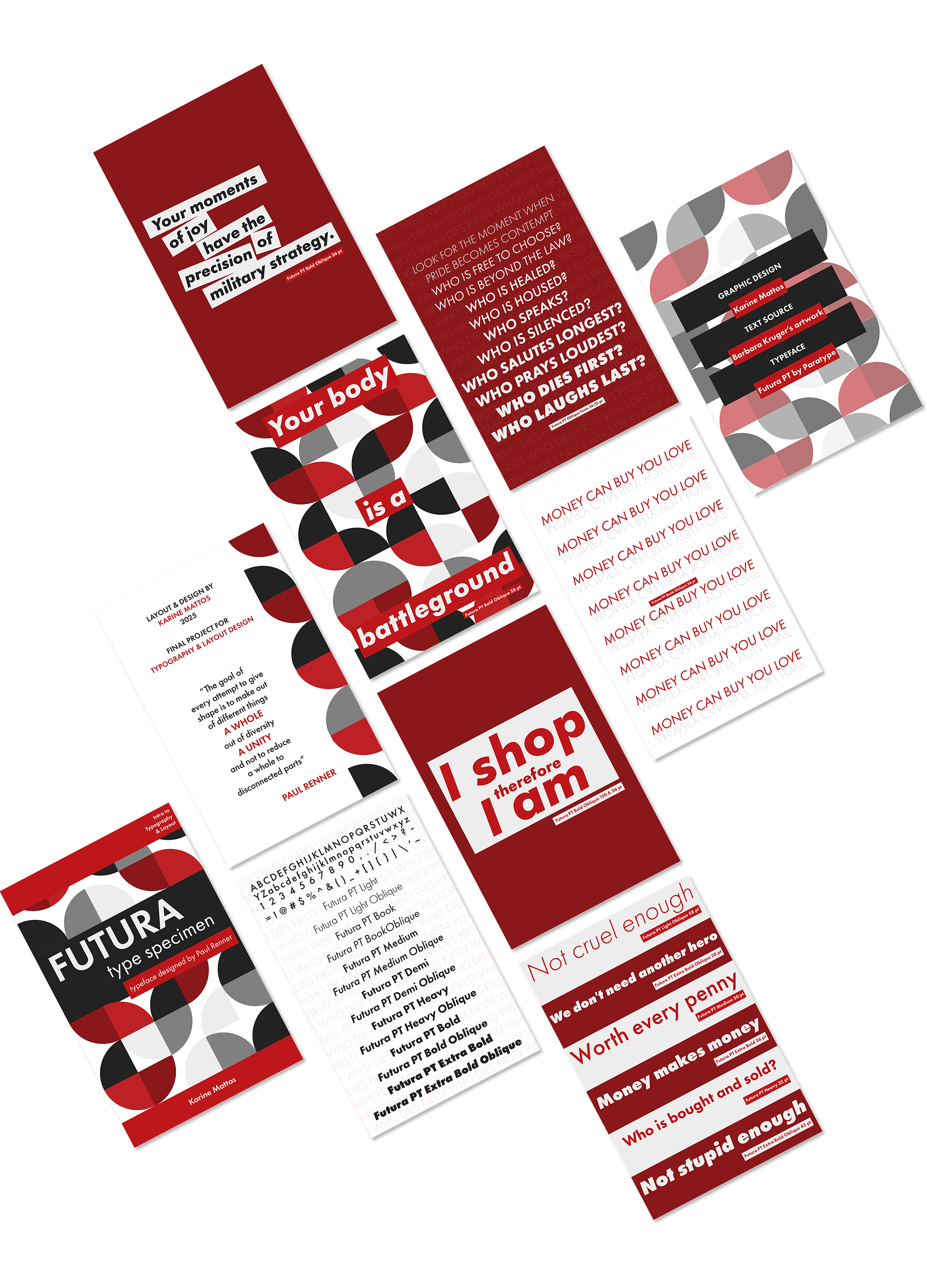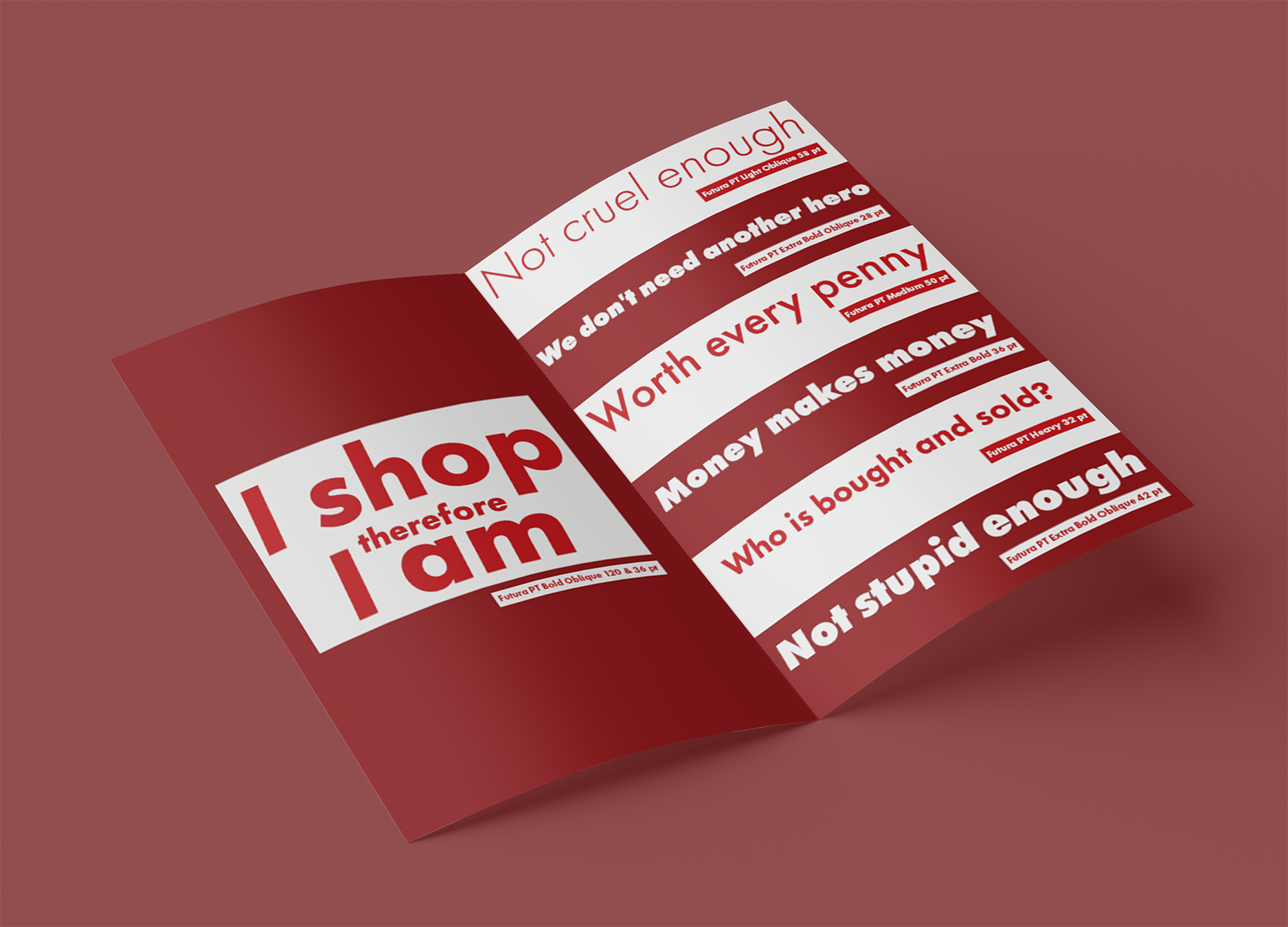
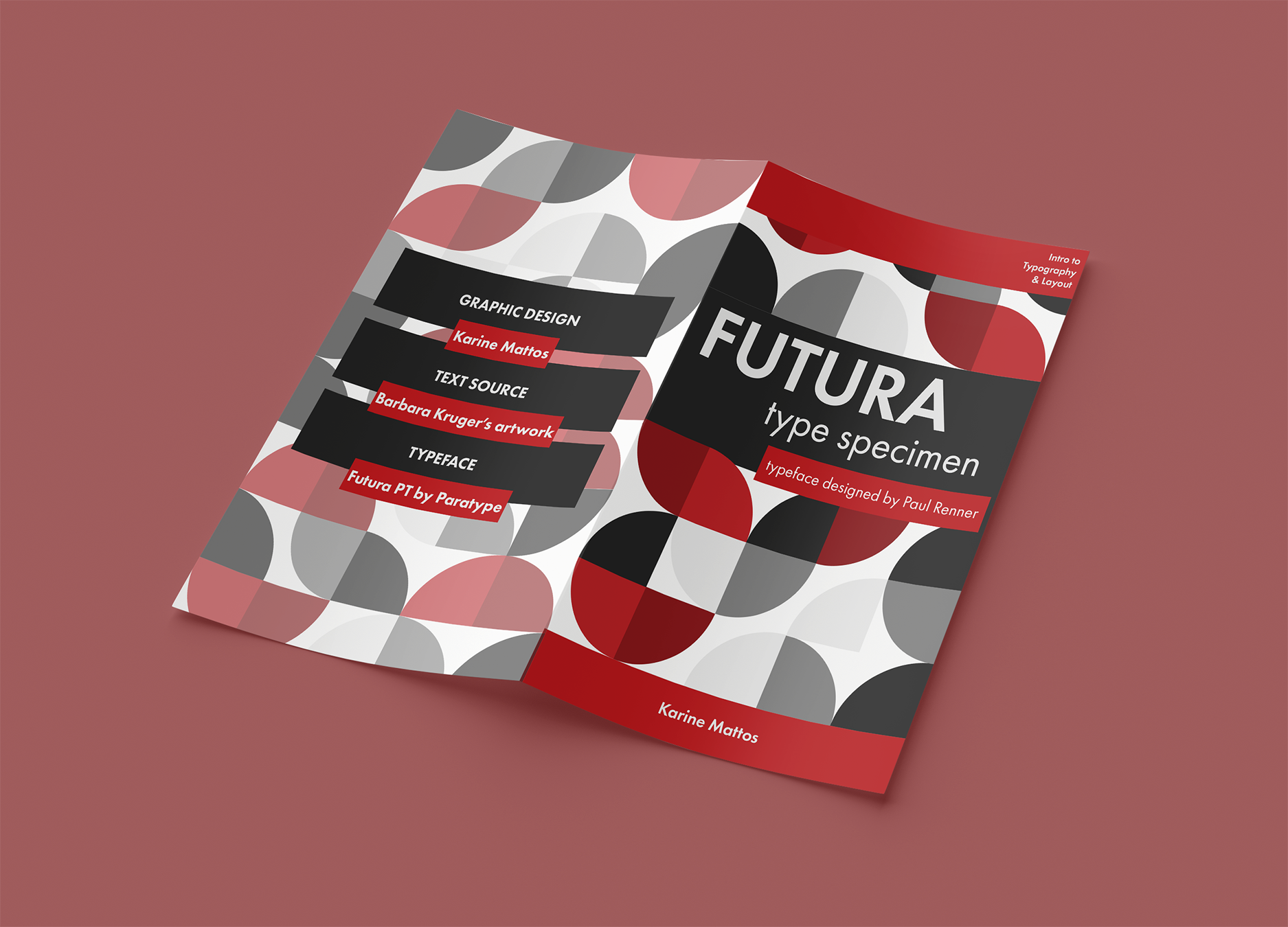
Type specimen booklet created in a college typography course. It showcases the Futura typeface, designed by Paul Renner in 1927, using layouts inspired by Bauhaus geometric patterns and the bold visual language of Barbara Kruger’s work.
Designed in Adobe Illustrator and laid out in InDesign.
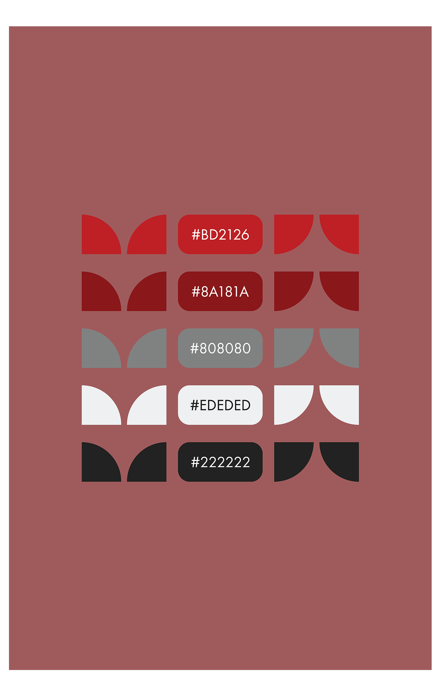
I started by looking at Bauhaus-inspired color palettes, but I ended up leaning more into Barbara Kruger’s bold contrasts. In Adobe Illustrator, using a modular grid, I built a simple Bauhaus-style geometric pattern and tested high-contrast color swatches on top of it.

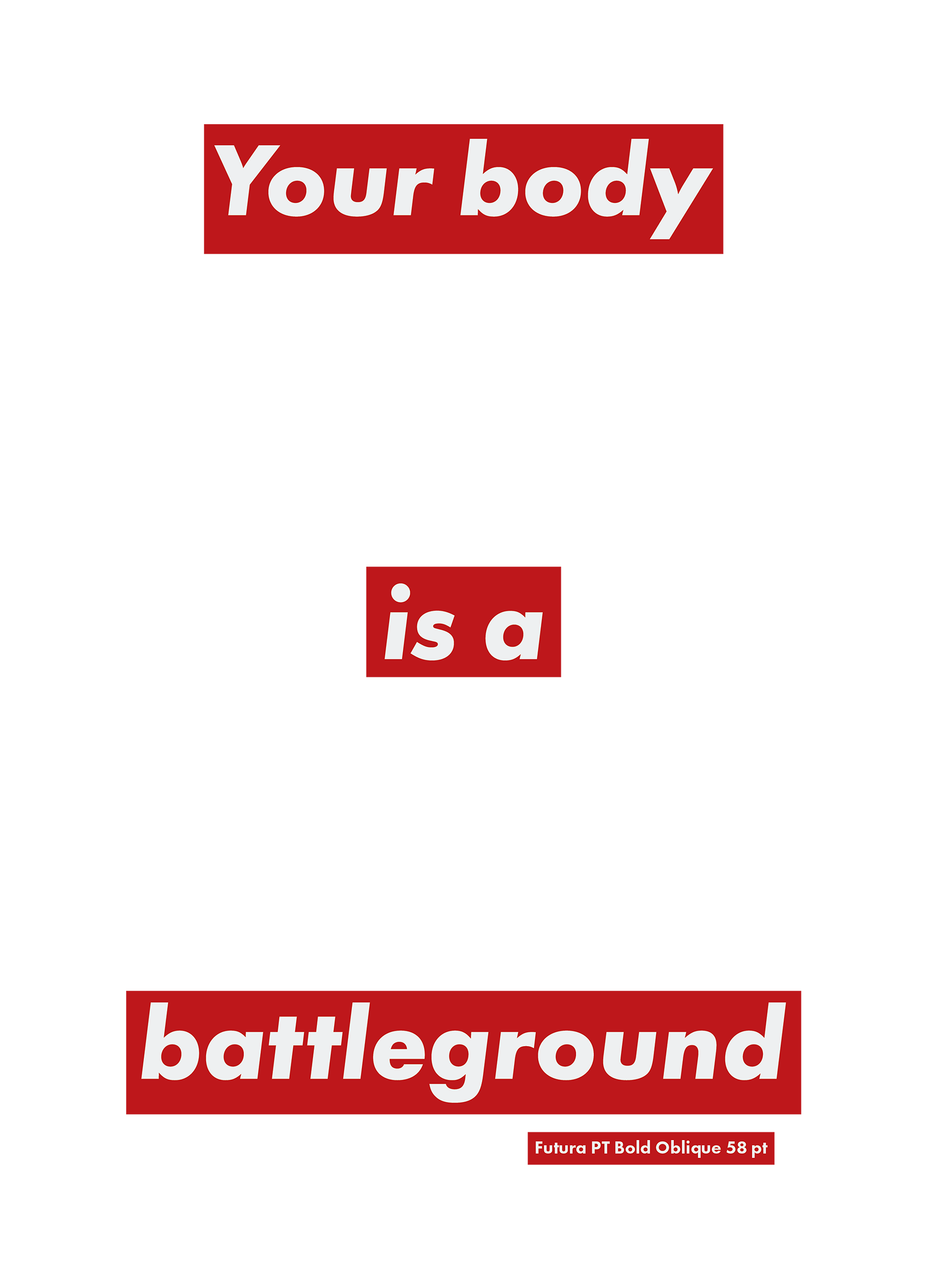
Next, I recreated some of Barbara Kruger’s slogans using Futura Bold Oblique, breaking the phrases into blocks to echo her cut-and-paste feel. It was a way to study her rhythm, spacing, and contrast while still keeping the typeface at the center of the piece.


I was interested in how Bauhaus’ “form follows function” approach to clarity and structure connects to Kruger’s more confrontational use of the same tools, so in this project I borrowed that modernist structure and used InDesign to push it toward a more critical, poster-like tone.