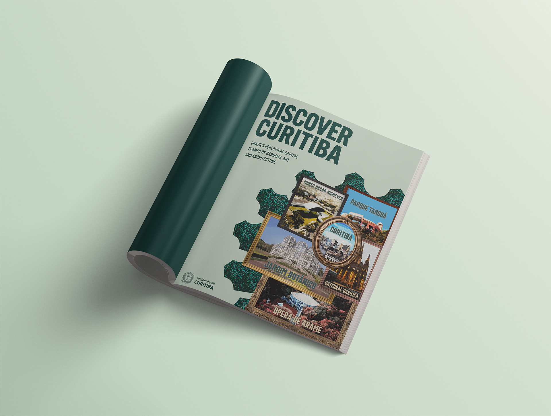
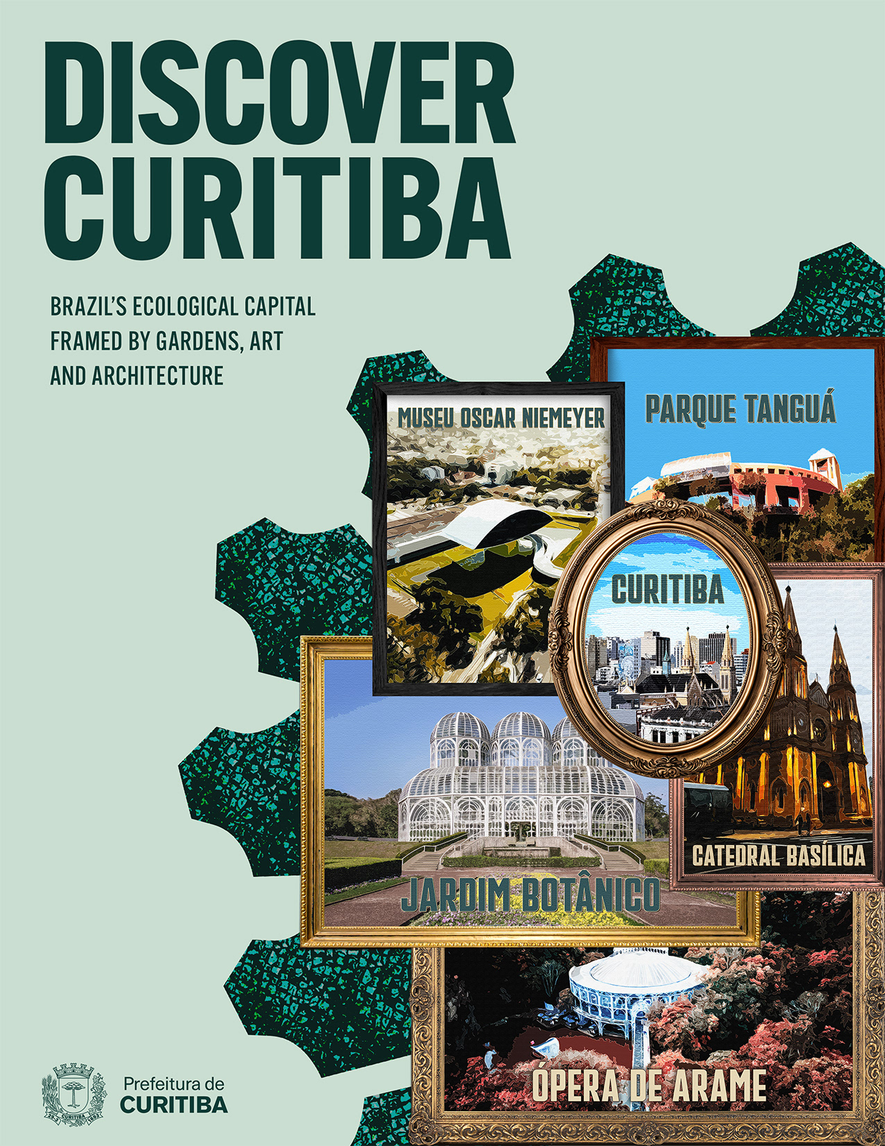
This tourism campaign was created for a college digital imaging course. It promotes Curitiba, my hometown and Brazil’s ecological capital, through a series of posters that combine local landmark imagery with decorative frames, textured green shapes, and a retro postcard effect. The goal was to create a tourism campaign that feels more personal and visually distinct from typical travel advertising.
Designed in Adobe Photoshop.
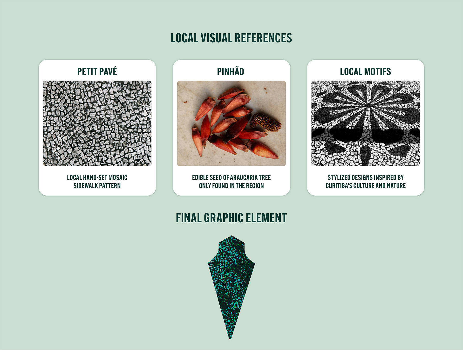
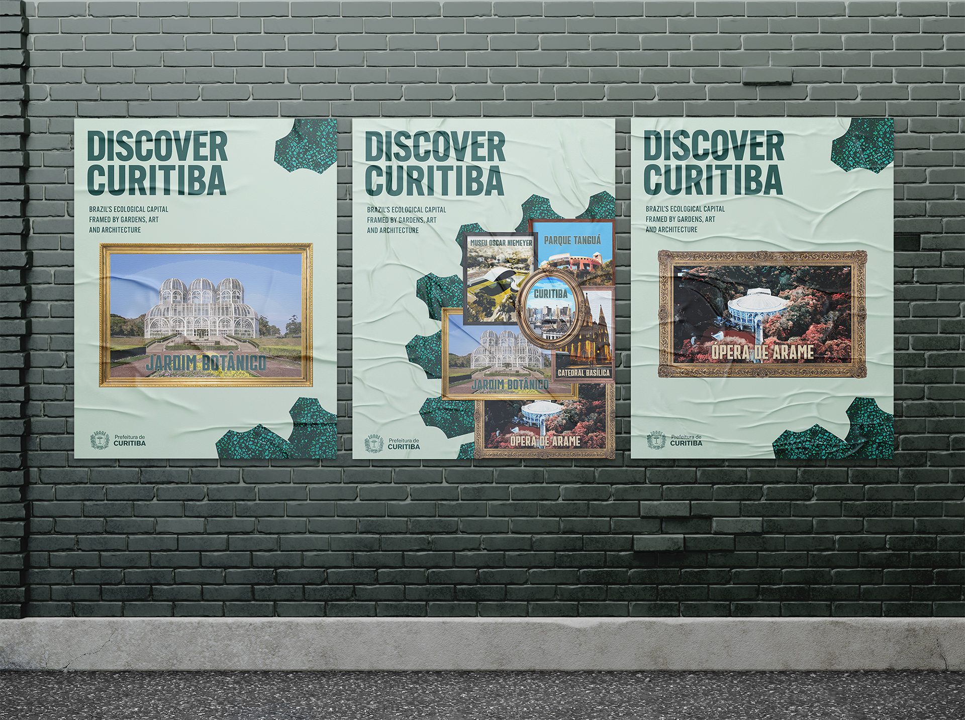
For the local visual references, I used Curitiba’s petit pavé (from French "small pavement") sidewalks and the pinhão (pine nut) as inspiration for the final graphic element. Pinhão is the edible seed of the araucaria tree, commonly associated with Paraná, the southern Brazilian state where Curitiba is located. Its shape influenced the graphic element's form, while the petit pavé mosaic helped create the texture. These details connect the campaign to the city through local references rather than obvious tourist visuals.
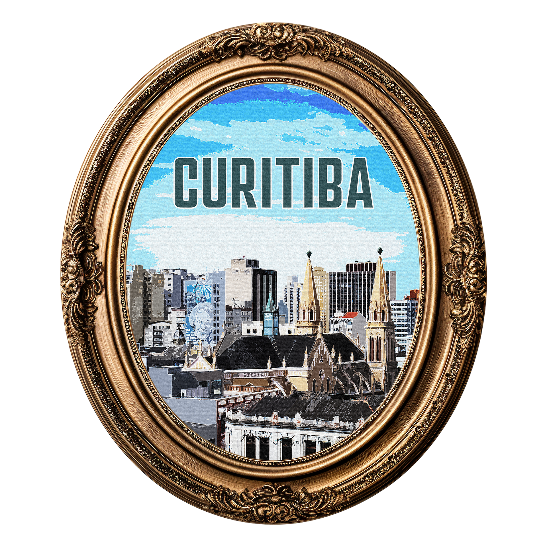
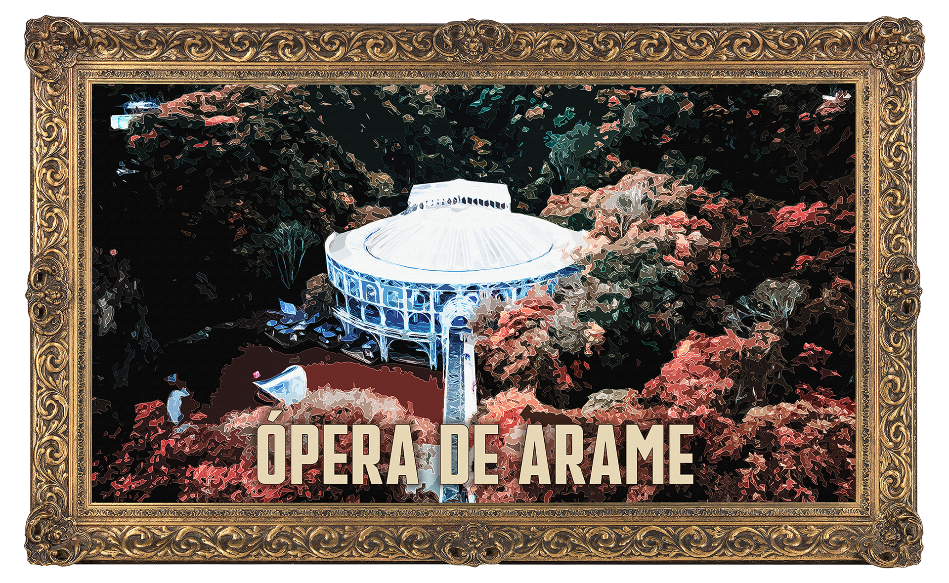
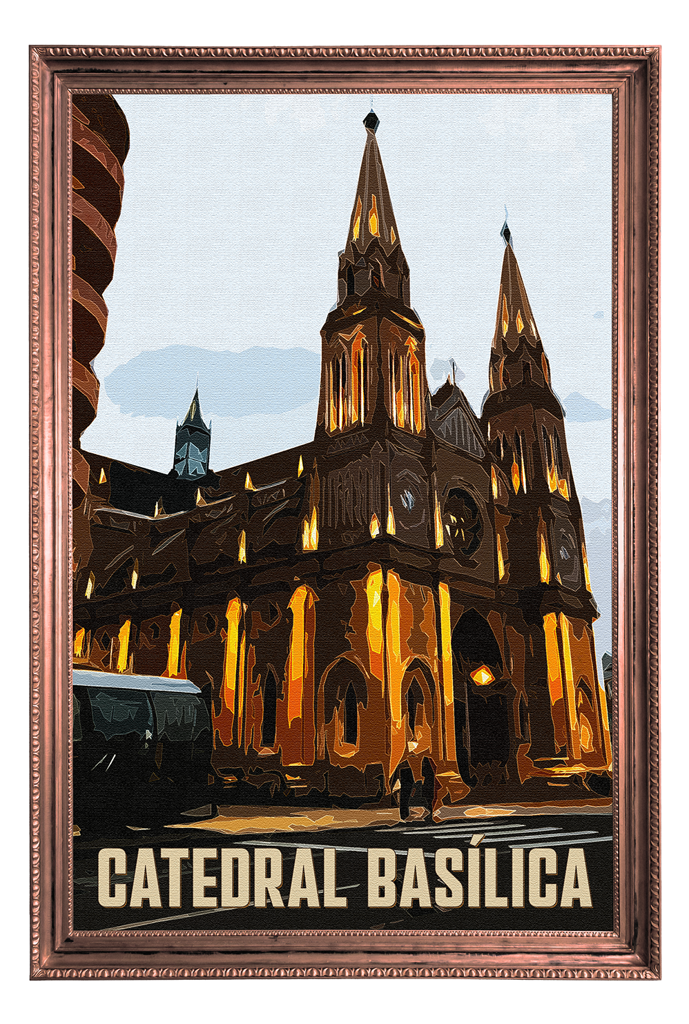
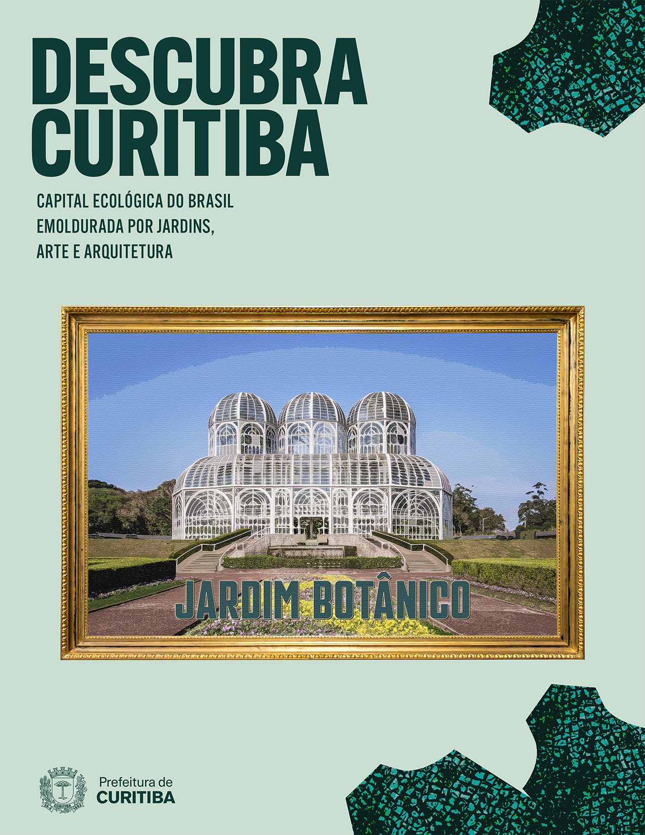
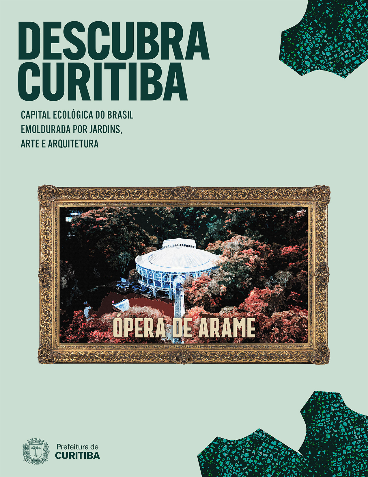
For the landmark images, I used decorative frames as a key part of the visual concept. They helped translate the idea of “framed by” into a visual element, connecting the campaign tagline to the design. The different frame shapes and styles also gave each location its own presence, and the image treatment made them feel slightly nostalgic. The variety of elements added visual interest and fit with the layered collage approach of the poster.
I also included the Prefeitura de Curitiba logo, Curitiba’s City Hall, as a campaign sign-off. This helps make the posters feel closer to a public tourism campaign and connects the design to the city’s official visual identity without taking attention away from the main concept.

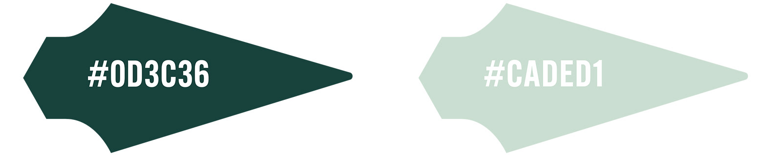
To keep the campaign visually connected to Curitiba’s identity as Brazil’s ecological capital, I chose a color palette with a limited range of green tones. The soft green background gives the posters a lighter, more open feeling, while the dark green creates contrast for the typography and graphic elements.
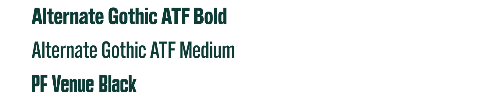
For the type, I used the Alternate Gothic ATF family because its condensed structure gives the campaign a strong poster-like feel. PF Venue was used in the framed elements to add a more decorative contrast and connect with the vintage tone of the image effect.
The campaign is composed of one main poster and two supporting pieces. The main poster works as the central design, while the supporting posters expand the visual system with individual landmark focused versions.
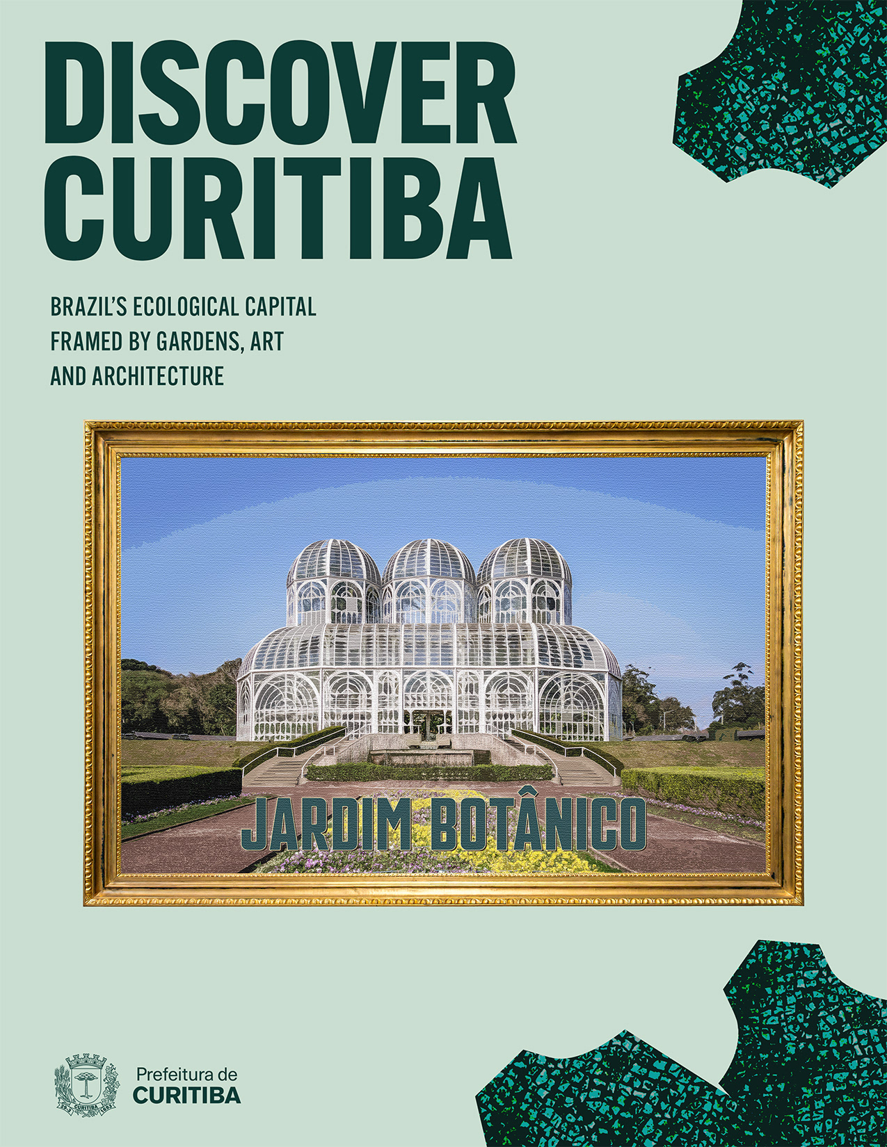
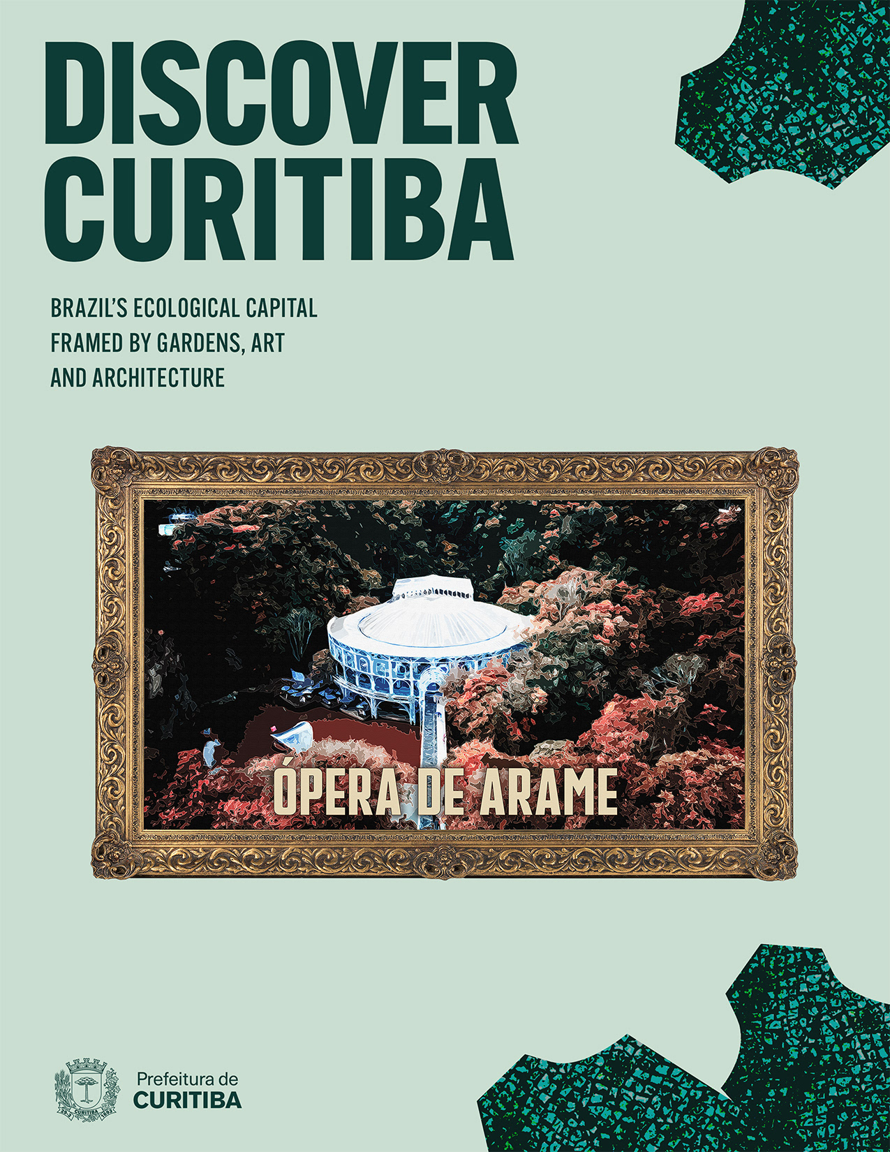
I also adapted the campaign into Portuguese to create a version for a Brazilian audience. The translation keeps the original “framed by” concept through the word “emoldurada,” preserving the connection between the tagline and the decorative frames.
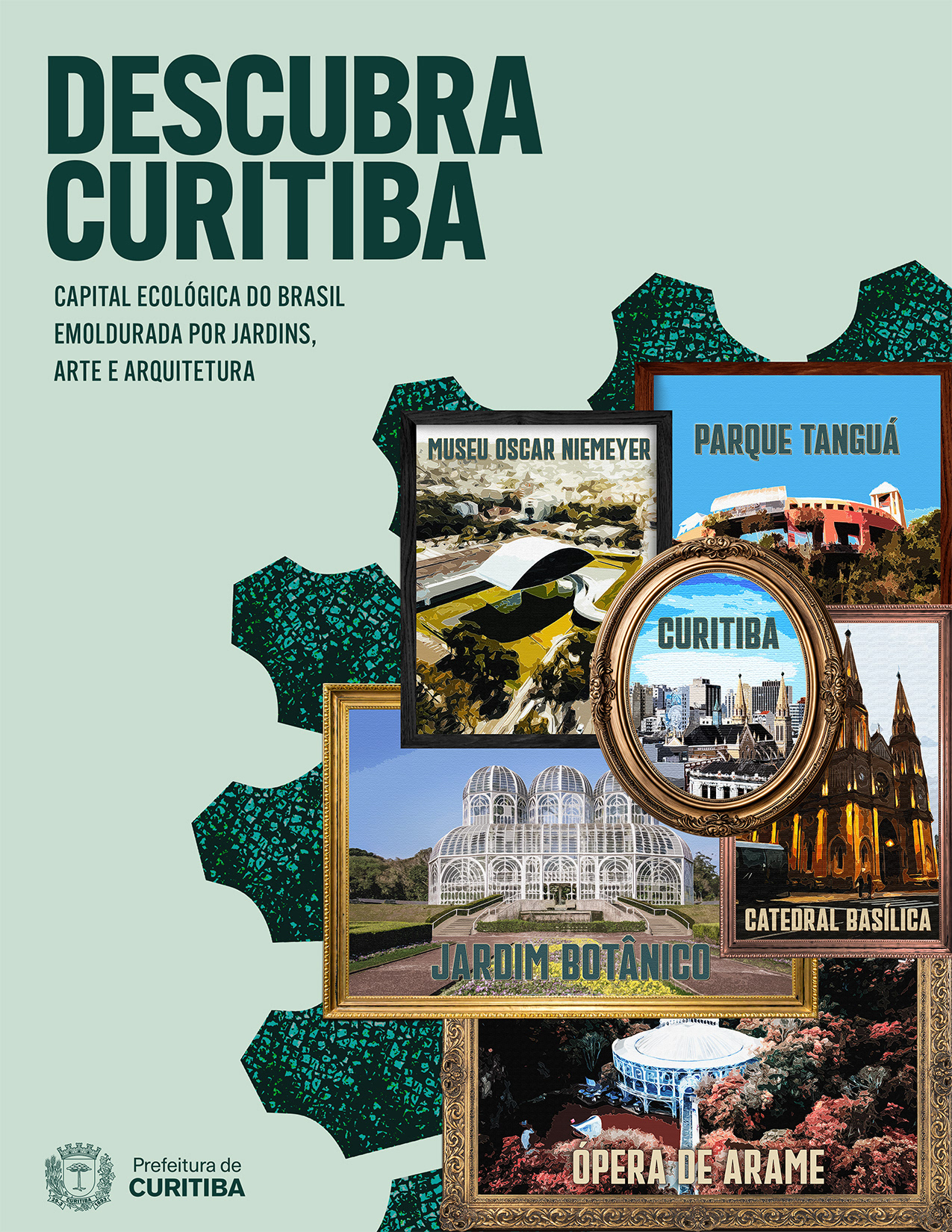
Student concept project. Not affiliated with Prefeitura de Curitiba.
Projeto conceitual acadêmico. Não afiliado à Prefeitura de Curitiba.