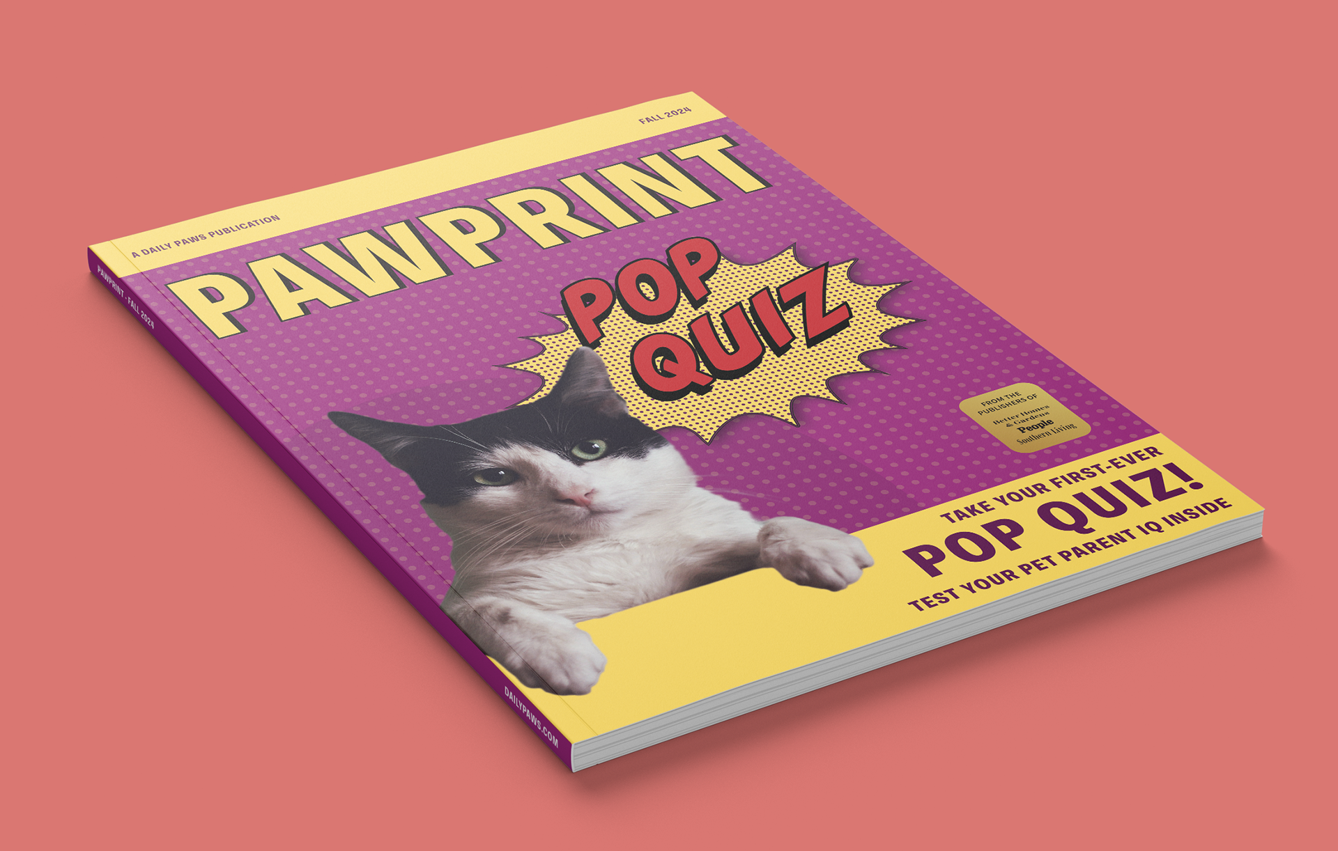
This project was created in a college publication design assignment and updates the cover and table of contents for PawPrint, a pet magazine. The brief was to redesign an existing issue around its “Pop Quiz” feature, so I took a different direction, using bright pop-art energy with halftone dots, bold comic-style type, and saturated color blocks. Layouts were built in InDesign, with illustration and photo work finished in Illustrator and Photoshop, including an alternate Portuguese version to show how the system adapts to another language.
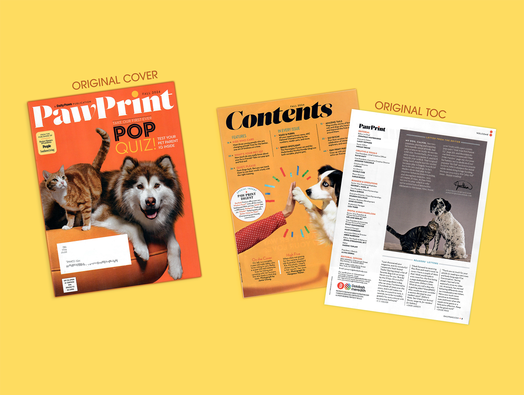
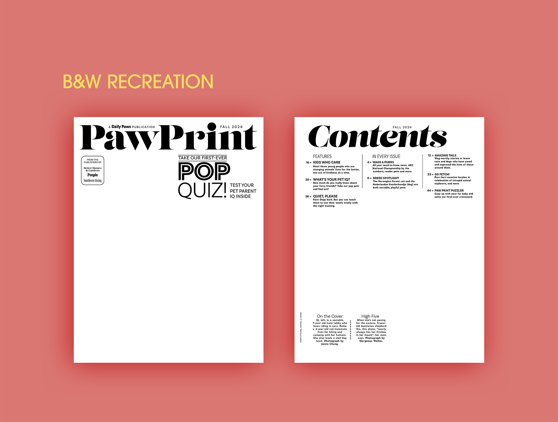
As a first step, I recreated the original PawPrint cover and table of contents in black and white, matching the layout, type hierarchy, and spacing as closely as possible. This stage was about following a clear specification, paying attention to how the magazine uses grids and typography, and getting more confident working in InDesign.
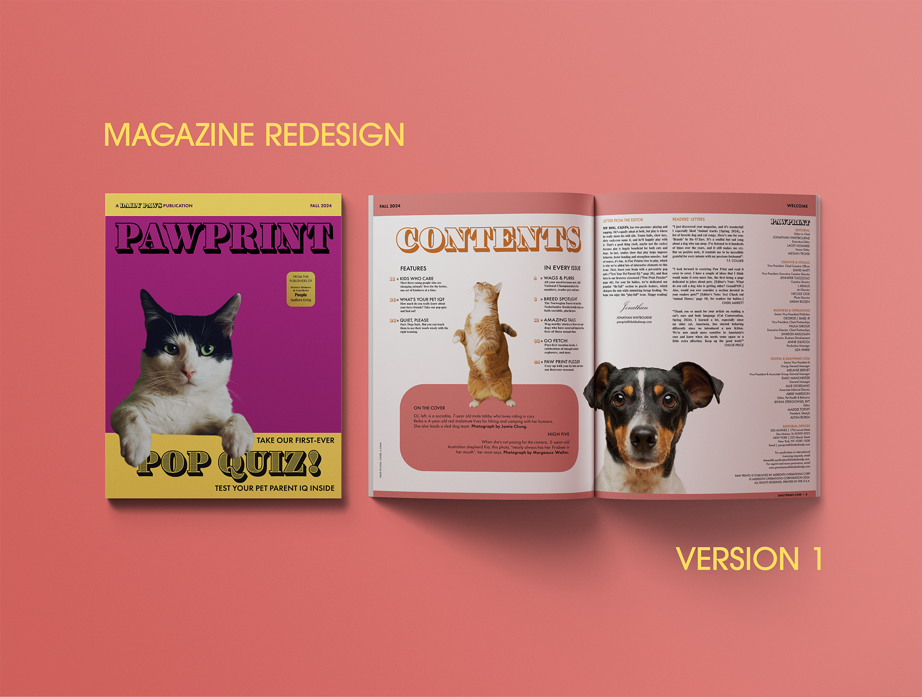
This layout was my first pass at the new cover and table of contents. I was mainly figuring out hierarchy and how the cover and TOC relate visually. The colors and type are still in progress, but this stage helped me test the structure before refining the design.
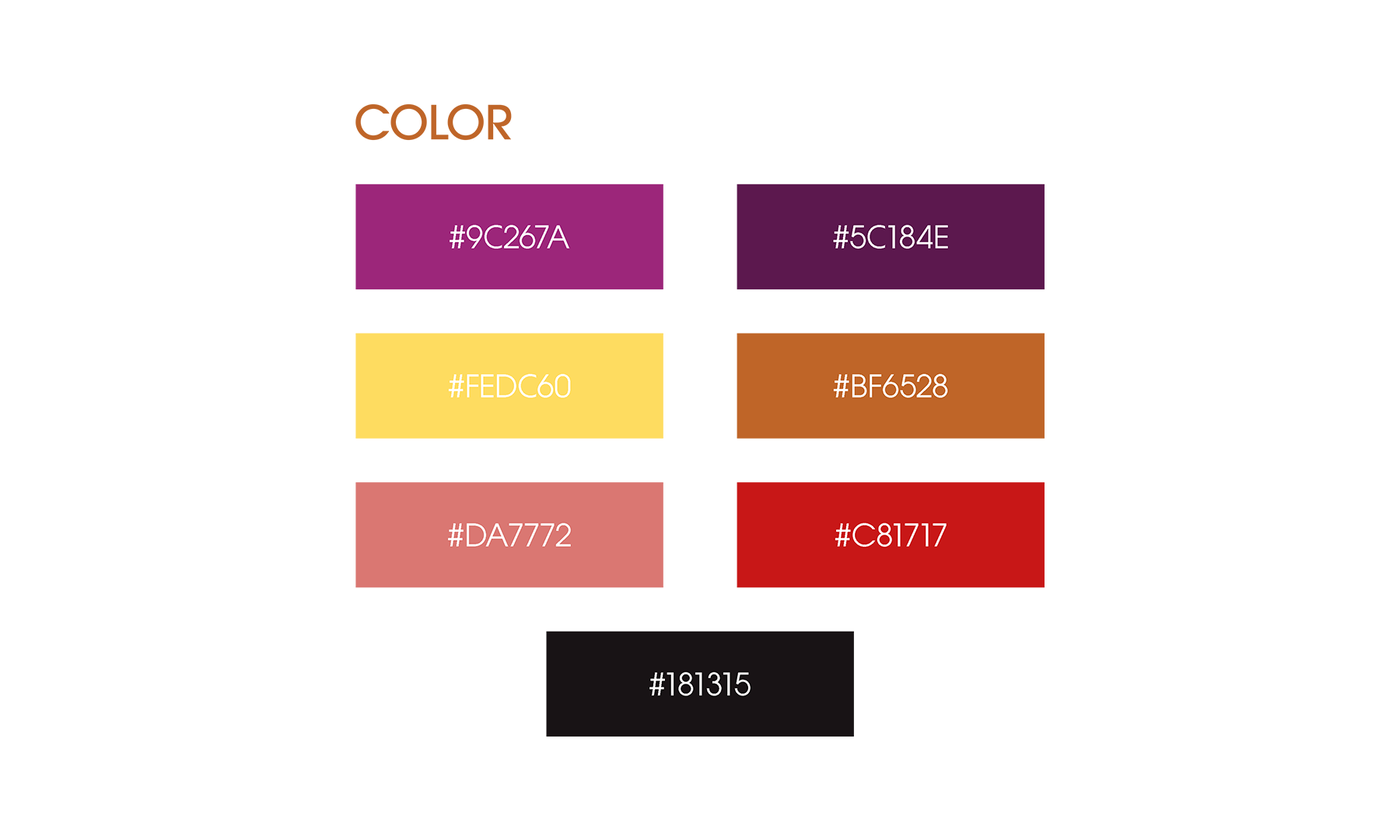
Color in this project is meant to feel loud and friendly, closer to pop-art posters than a typical pet magazine. The palette mixes saturated brights with warmer tones, keeping the pages playful while still giving photos and text contrast to be easy to read.
For type, I mixed some bold, display-style titles with more neutral serif and sans-serif types. The louder styles carry the PawPrint masthead, the “Pop Quiz” callout and key headings, while the simpler ones keep the longer text and small details easy to read.

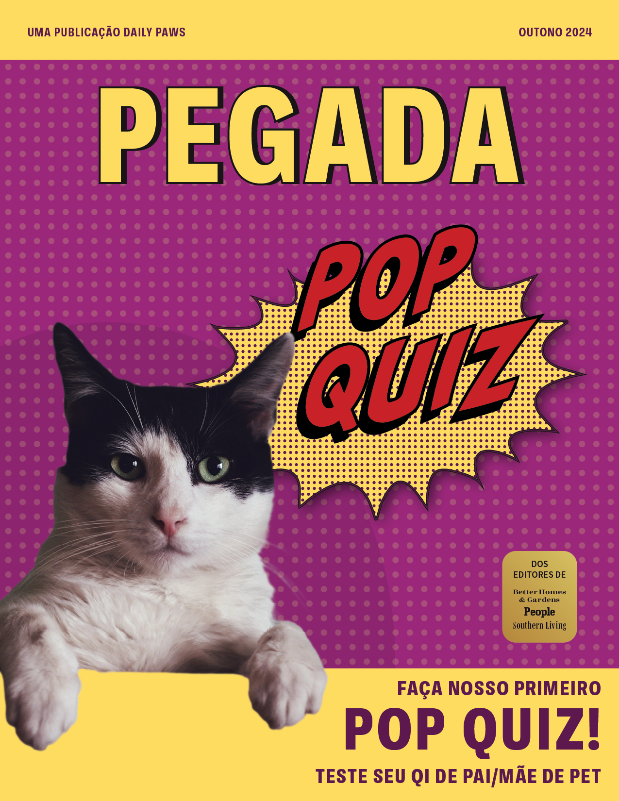
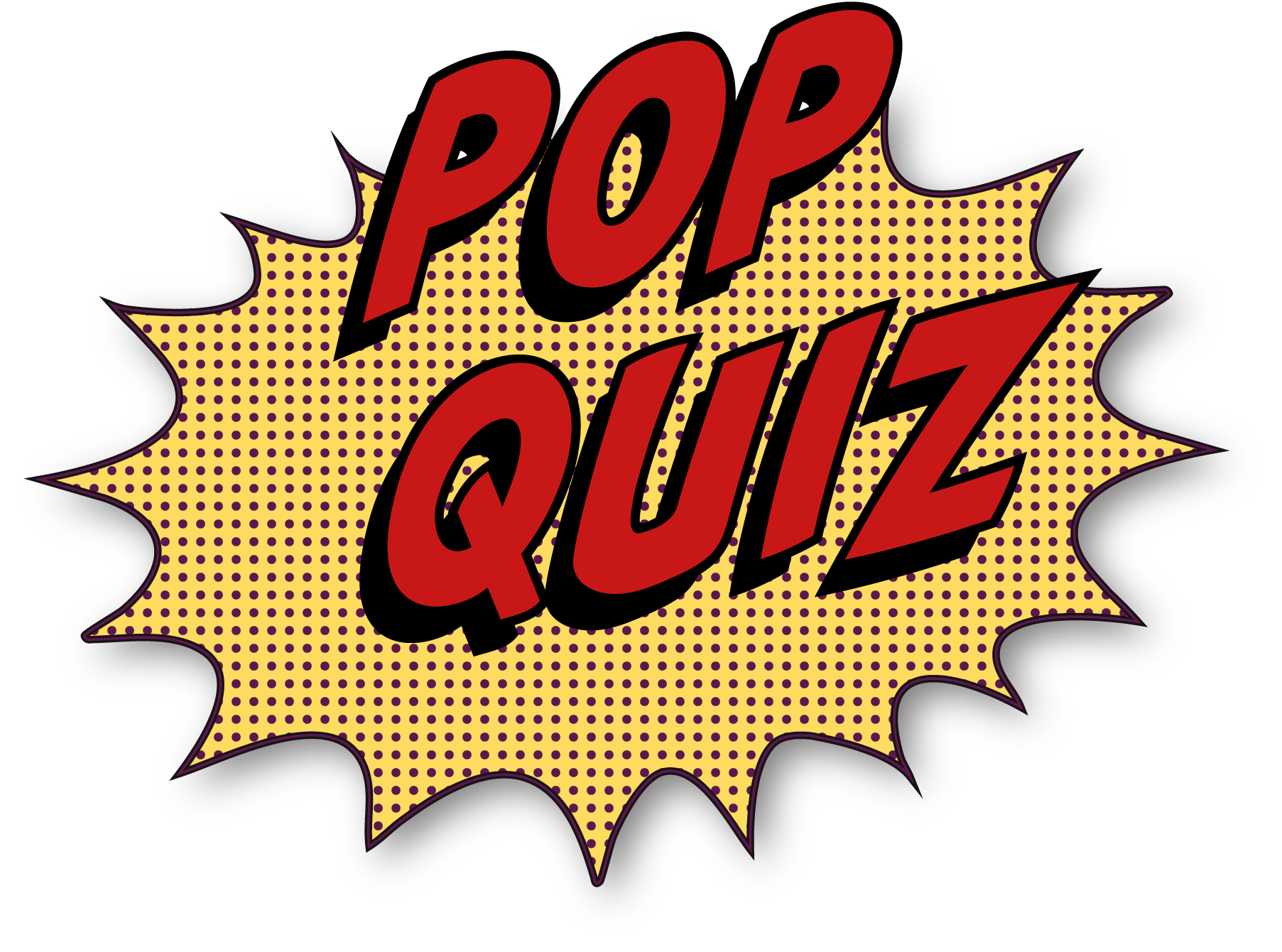
I built the “Pop Quiz” graphic in Illustrator, inspired by classic loud sound-effect bursts in comics. The pointy burst, halftone dots, and red comic-style type with a heavy shadow push the cover fully into a pop-art direction and match the loud quiz theme.
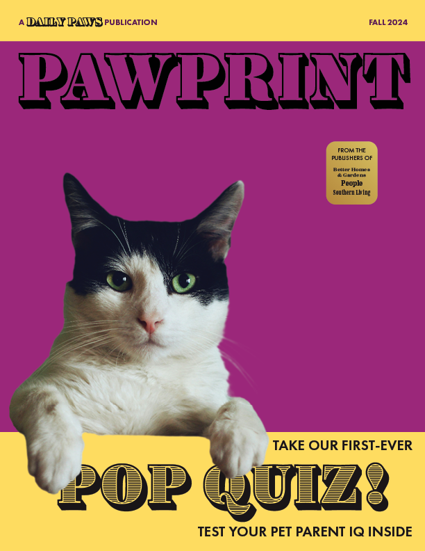
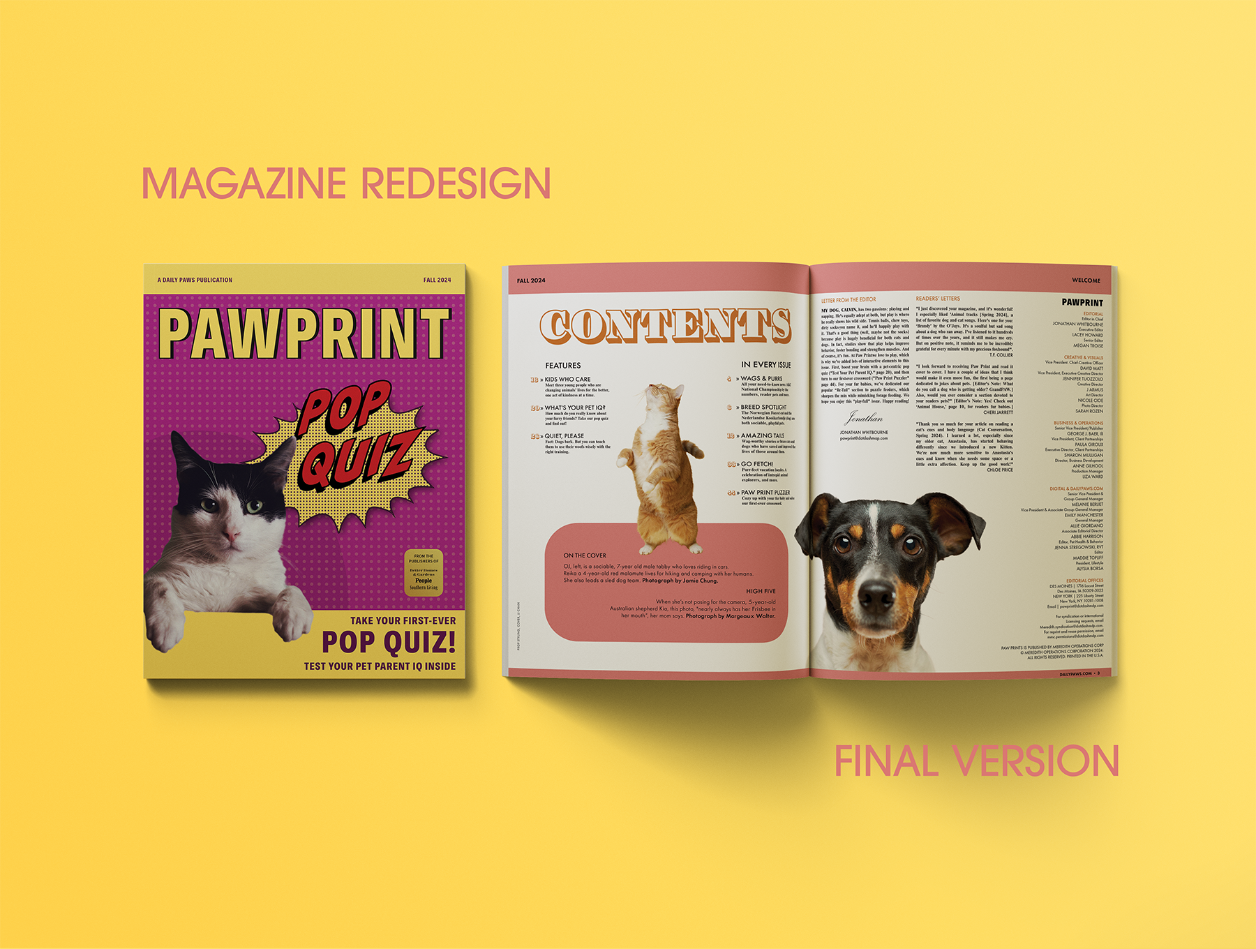
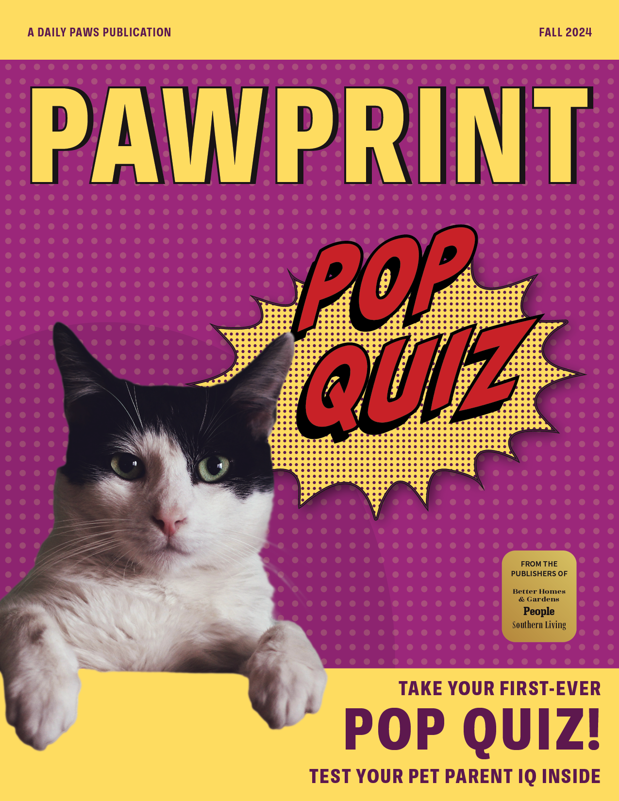
On the final cover, the big yellow bands and deep purple block frame the cat photo and the “Pop Quiz” burst. The PAWPRINT masthead in Ballinger Condensed is heavy and stable, while the comic-style starburst and halftone dots push the quiz feature into full pop-art mode. The same condensed sans serif in the yellow bands ties together the taglines and issue info, keeping all the smaller lines readable against the busy background. A small, gold, sticker-like promo badge adds extra info but still feels part of the overall system.
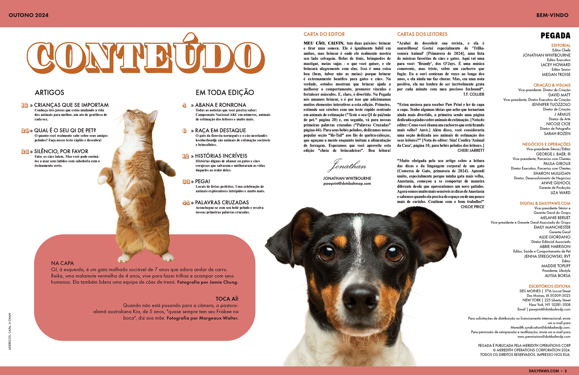
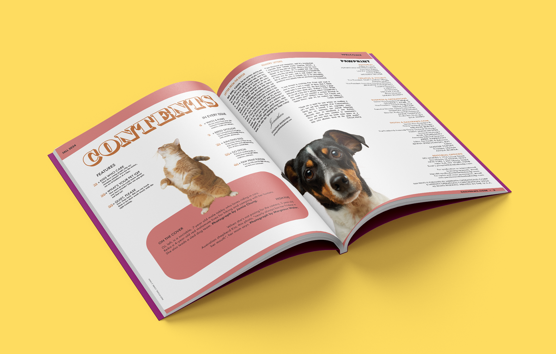
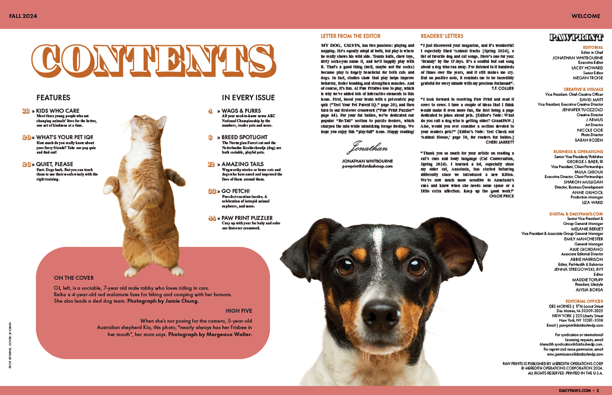
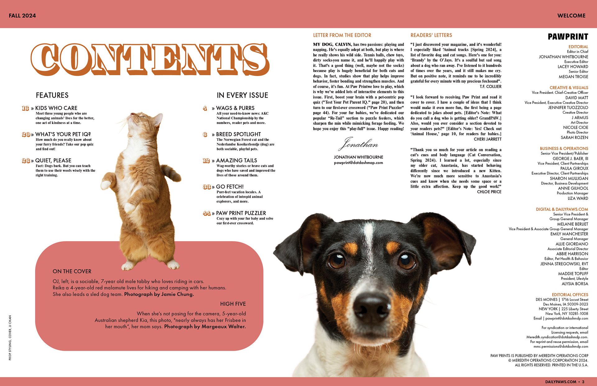
In the table of contents, color and type echo the cover without copying it. A wide band at the top, a rounded shape at the bottom, and the big “Contents” title in Ingeborg hold the structure, while Futura PT handles labels and numbers and Nimbus Roman carries the long text blocks. The section numbers and dog photo guide the eye through the page so the spread feels busy and playful, but still organized and easy to read.
This alternate version translates the cover and contents into Brazilian Portuguese while keeping the same grid, color, and type system. Changing PawPrint to Pegada and Contents to Conteúdo shows how the layout adapts to another language without changing the overall hierarchy.